WEBSITE REBRANDIND

Case Study
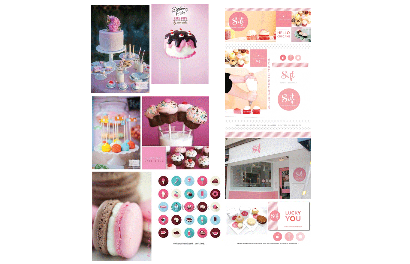
Rebranding website to provide the client with a much easier way of shopping cupcakes. This website will consist in a more simple and easier way to look at the website. The target audience is for those who not only like the decorative cupcakes but want to shop more about the specifics of the company. I can imagine a layout that is based on pictorial elements for the consumer to easily identify what they are looking at.

Process Work
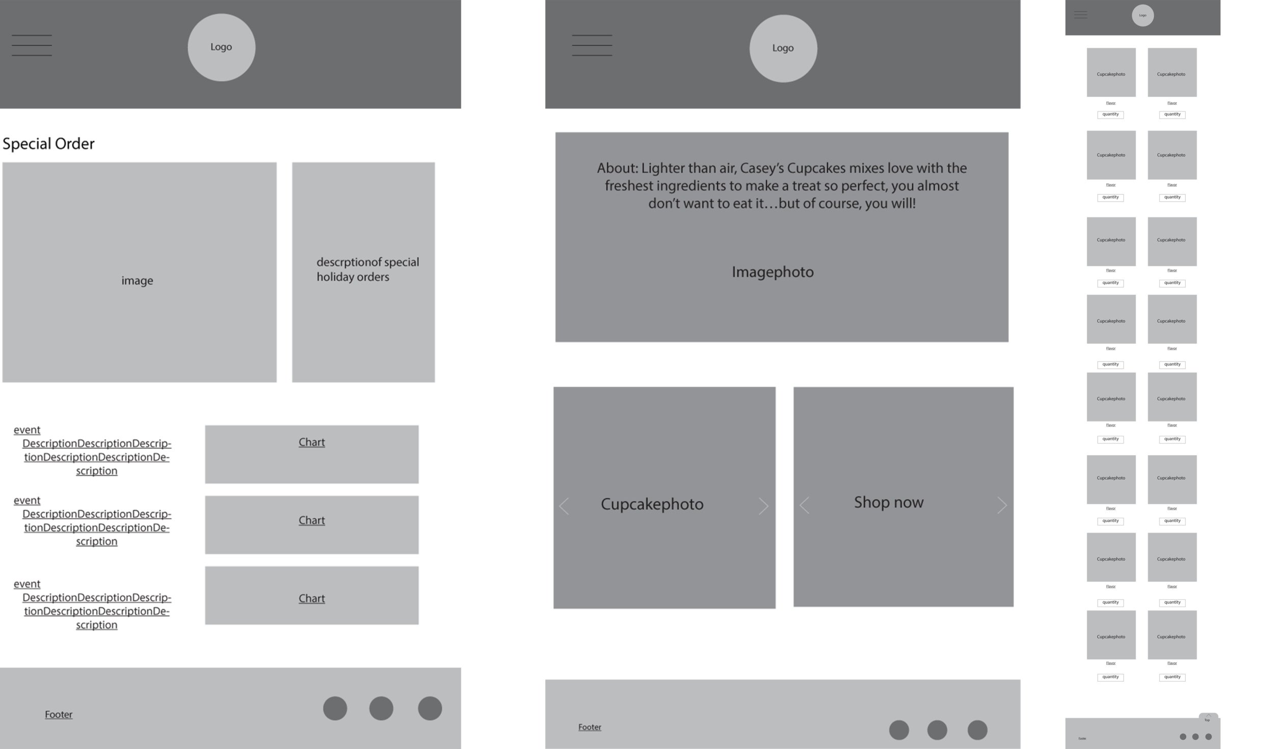
This website demonstrates different size platforms, easy to be able to find whats being looked for with the layouts and for in different devices. Initially various wireframes were created through the process to know how to organize the content of the website.

Final Product

